Web Design
8 min read
Instant Booking UX: Fixing a Slow Checkout
The friction points that kill UAE booking conversions — hidden pricing, long forms, delayed confirmation — and what replacing them actually looks like.
By NxFold
Updated 7 Sept 2026
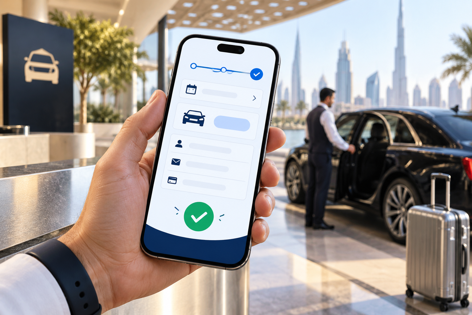
When a booking business has plenty of traffic and not enough bookings, the instinct is to redesign. New photography, a cleaner layout, a stronger brand.
Usually the problem is not how the site looks. It is that somewhere between choosing and confirming, the visitor is asked to wait — for a price, for a reply, for an email — and waiting is where the booking dies. In a market where the same customer has two competitor tabs open, a wait is a decision made for you.
This is about removing those waits.
The Short Answer
Every booking flow has a handful of moments where the visitor has to stop and wait for someone or something else. The conversion work is finding each one and removing it.
The four that account for most losses:
- Price behind an enquiry. The visitor cannot compare, so they go somewhere they can.
- A form that asks for more than you need to hold the booking.
- "We'll confirm by email." The session ends and the intent goes with it.
- A desktop layout on a phone, when the decision is being made standing up.
When we rebuilt the reservation flow for Let's Go, a Dubai car rental brand, the rule was exactly that: the price updates as you select, delivery is chosen inline, confirmation appears on screen. The estimated result was an average booking time under three minutes and a meaningful lift in mobile conversion — and none of it was a redesign of how the cars look.
Wait #1: The Price
Hiding the price is the most expensive habit in this category, and the reasoning behind it is always the same: rates vary, we want to have a conversation, we do not want competitors to see.
The competitor already knows. The customer comparing three options at midnight does not, and cannot wait until Sunday to find out. Every enquiry-for-price flow is filtering your market down to people willing to negotiate, which is a small fraction of it.
Instant pricing is a data problem, not a UI one. The rate logic has to live in one place the interface can read — season, duration bands, delivery zone, extras — resolving server-side as the selection changes. What the customer sees is a single number that updates. What you maintain is a rate table, not hard-coded prices scattered across pages.
If your rates genuinely cannot be computed — bespoke work, negotiated contracts — publish the model instead: what drives the number, and a realistic range. A range with an explanation converts far better than silence.
Wait #2: The Form
Most booking forms are designed around what operations wants to know eventually, not what is needed to hold the booking now.
The test for every field: does this prevent me from taking the booking if I do not have it? If not, it belongs after confirmation, or at handover, or never.
In practice that usually means: what, when, where, name, phone. Not company name, not how you heard about us, not a message box, not a full address for a booking that will be collected. Each additional field is a chance to reconsider.
The UAE-specific version of this is documents. Licence photos, Emirates ID, passport copies — all genuinely needed, none needed at checkout. Collect what holds the booking, defer verification to handover, and you keep the flow intact without giving up compliance.
Wait #3: The Confirmation
"We'll get back to you shortly" is the sound of a booking becoming a lead.
The moment a visitor completes an action, the outcome should be on screen — confirmed, or held, or on a waitlist, but known. Email confirmations are a record, not a confirmation. If the screen says "we will contact you", the customer is now waiting, and while they wait they are still browsing.
Where instant confirmation genuinely is not possible — availability that needs a human check, a resource that might be double-allocated — the fix is to say so precisely: "Held for 30 minutes while we confirm the vehicle. You will hear from us within 10 minutes." A specific promise is not a wait in the same way an open-ended one is.
Wait #4: The Phone
In this market a large share of booking decisions happen on a phone, frequently standing outside, frequently on mobile data.
Designing thumb-first is not a smaller version of the desktop flow — it changes what goes on each step. Date pickers are the usual disaster: a calendar built for a mouse is close to unusable one-handed. So are multi-column forms, tiny tap targets and anything requiring horizontal scroll.
Speed is part of UX here, not a separate concern. A flow that is beautifully designed and takes six seconds to load has lost before it starts — see Core Web Vitals for UAE businesses for what to measure and what actually moves.
Deposits, Verification and Real Constraints
The objection to all of this is always the same: our business has real requirements that a fast flow cannot accommodate.
Usually it can, by separating what holds the booking from what completes the transaction.
- A deposit pre-authorisation can happen at checkout in a single step, without a full payment.
- Document verification happens at handover, where you are checking the physical item anyway.
- Signatures and terms can be accepted digitally at checkout and formalised later.
The higher the value, the more this holds. On a luxury fleet like Superior's, the enquiry-and-handover model is the right call — but even there, publishing daily and weekly pricing on the card removed the phone call that used to stand between a visitor and a number.
On the payment side, the choices matter more here than the amounts suggest: a checkout that only offers cards in a market that uses wallets adds friction at the worst moment. Payment gateway integration in Dubai covers the options.
Measuring It
Three numbers tell you where the flow is losing people:
Step completion rate. What share of visitors who start the flow reach each step. The step with the biggest drop is your problem, and it is rarely the one people assume.
Time to complete. Median, not average — averages are distorted by people who left the tab open. If it is climbing, something has been added that should not have been.
Abandonment by device. If mobile is dramatically worse than desktop, the flow was designed on a desktop.
Instrument these before changing anything. Redesigning a checkout without knowing which step loses people is guessing expensively.
Common Mistakes
Redesigning the whole site. The problem is usually four moments in the flow, not the visual design.
Adding fields "while we are at it". Every field added to a working flow costs conversions. Fields should have to justify themselves.
Trust badges instead of trust. A clear cancellation policy and a real phone number do more than a row of security logos.
Optimising the wrong step. Fix the biggest drop-off, not the most annoying screen.
Ignoring the post-booking moment. A confirmation screen that tells the customer what happens next reduces support calls and cancellations.
Frequently Asked Questions
How do we show a price instantly when rates vary by season and duration? The rate logic lives in one place and the interface reads it — season, duration bands, zone and extras resolve as the selection changes. The customer sees one number that updates; you maintain a rate table rather than prices hard-coded across pages.
We take a deposit and verify documents. Does that break an instant flow? Only if you collect everything at checkout. Take what holds the booking — a deposit pre-authorisation — and defer document verification to handover, where you are inspecting the item anyway.
What if we genuinely cannot confirm instantly? Say exactly what happens and when: "Held for 30 minutes while we confirm. You will hear within 10 minutes." A specific promise is a different experience from an open-ended wait, even though both involve waiting.
Should we rebuild or fix the existing flow? Measure first. If one step is losing most people, that is a targeted fix. If the flow is fundamentally an enquiry form pretending to be a booking, that is a rebuild. Instrumenting step completion tells you which within a fortnight.
How do we know where people are dropping off? Step completion rate, median time to complete, and abandonment split by device. Those three identify the problem step, and it is frequently not the one the team expects.
Does this apply to businesses other than car rental? Anywhere a customer picks from stock at a price that varies by duration — equipment, boats, venues, chauffeur transfers, clinics. The pattern is the same: resolve the number early, remove the reply-and-wait.
Will publishing prices hurt our margin? It changes who enquires more than it changes what you can charge. You lose the negotiation-first customers and gain the far larger group who will not enquire without a number. If some segments genuinely need bespoke pricing, publish the standard tiers and route the rest to an enquiry.
How long does rebuilding a booking flow take? Six to ten weeks including rate logic and payment. Less if you already have a system with an API; more if rates live in a spreadsheet, because the rate model has to be built first and that is where the time goes.
The Bottom Line
Booking conversion is rarely about persuasion. The visitor already wants what you sell — they arrived, they chose, they got most of the way. What stops them is being asked to wait at a moment when a competitor is one tab away.
Find the waits. Resolve the price early, ask only for what holds the booking, confirm on screen, and build for the thumb. That is usually the entire project, and it is a smaller one than a redesign.
If your traffic is fine and your bookings are not, get in touch — we will instrument the flow before proposing anything. The design side sits under web design in Dubai, and the transactional side under e-commerce development.
Have a project in mind?
Ideas to put into practice.
Turn what you have learned into a clearer plan for your website or product. Tell us what you want to build.
Start your project